An Answer to the Problem – Responsive Web Design

In my earlier post, “What is Responsive Web Design? The Problem…“, I outlined one of the many issues facing web developers today, namely how to deal with all of the different devices, screen sizes, and capabilities now available for users to interact with a web site.

One answer is to use Responsive Web Design.

Responsive Web Design is a concept that was first introduced by Ethan Marcotte on the A List Apart web site on May 25, 2010. His article title simply Responsive Web Design lays out a concept of designing and developing a web page that adapts to it’s environment to provide an elegant and efficient user experience, regardless of whether a user is using a high definition desktop monitor, or a cell phone with 320 x 480 pixel resolution.

Responsive Web Design uses a combination of fluid grids, flexible images, and CSS3 media queries to create a platform agnostic web site, that adapts and reflows as needed,hiding or reveling elements, or changing font sizes, line heights and leading to introduce alternate page layouts as the resolution changes.  to optimize the reading experience on different screen sizes.

While Ethan’s solution is powerful, and elegant, it is not the solution for every situation. Careful consideration needs to be given to each project, to provide the most appropriate solution. This is a topic that Ethan himself addressed in a blog post on his website Unstoppable Robot Ninja, which is a great read for anyone who is serious about web development.

The great news is that people are jumping on the Responsive Web Design bandwagon, and producing some incredible websites.  Here is just a small sampling of some of the websites that I have run across:

And there are so many more. In fact, this concept is catching on so well, that Ethan has written a book Responsive Web Design, which is being released from A Book Apart on June 7. I am very excited to get my hands on this book. I follow several people on Twitter who have gotten a sneak peek, and they all have rave reviews.

I am a firm believer in the power of Responsive Web Design, and over the next several months I will be spending a lot of time researching, investigating, and practicing with the concepts. I will do my best to share what I learn in this blog, so I hope you will continue reading.

Getting Values from Textbox in Nested ListView Controls

A few days ago, I was given a task to build a simple web application to maintain and display the results from an upcoming local election. Since this was supposed to be a very simple election, using a hand counted paper ballot, I didn’t think it would be that difficult.

I decided to use the ListView control that I had recently learned of  (Yes, I am very behind). The ListView control made it very easy to build both the data output, and the input form, by binding a datasource to the parent control with a record for each race being run. I then bound a secondary datasource to a nested ListView control for each record to display the candidates for each race.

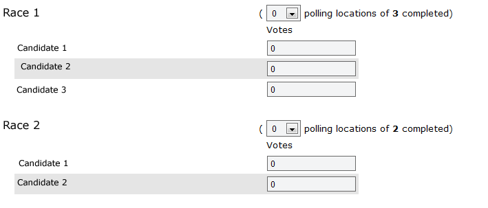
Here is a screen capture of the simple input form I built.

Paper Ballot Maintenance Screen

The front-end code example: ListView-front end Code Example


There are a lot of different ways to handle this code, but this was a rush job, and needed to get done quickly.

The plan was to have the Elections folks enter the votes received data as they get it from polling locations on election night after the polls close,  and then update the datasource as needed.

This sounded simple, until I tried to get the data from the text boxes in the nested ListView. Then things got complicated. And while I searched and searched on-line for a solution, I didn’t find one that fit my particular circumstances.

I started out looping over the top level ListView, and getting the values from each of the drop-down fields. This went smoothly. But I quickly found that I didn’t have access to the text box fields, as they were in a child object. The solution I finally came up with is the following excerpt from the code behind file: ListView-codebehind Code Example

The trick turned out to be to find out how many items are in the ListView, start a for loop going the same number of times as items in the ListView. At each iteration of the loop, get the information you need, and load it into whatever you need to interact with the data. In my case I am loading it into an object for later processing.

In addition, look for a child ListView control. In this case, I put it into a try/catch, so I could proceed even if one isn’t present. Instantiate a new ListView object in the code behind, and load the child control into it. You now have access to all of the data present in that child ListView control. Repeat the process from above: loop over the ListView object, now looking for your text boxes. Load each one of them into a new TextBox object, and you have the data.

It seems cumbersome, and probably is. Let me know what you think, or if you have a better way of handling this. I am sure that there is a more elegant way to accomplish this, and I would love to know about it.

What is Responsive Web Design? The Problem…

As I said in my last post, one of the initial purposes of this blog is to document my learning curve in the use and understanding of a relatively new methodology called Responsive Web Design. But what is Responsive Web Design?

The Problem

In the past,  web development focused exclusively on the desktop web browsers. We worried and agonized over how different browsers would present our code; if Internet Explorer’s handling of web standards and CSS would break everything, and cause us hours or rework and hacks; if we should use a fluid of fixed width design; and if we decided on fixed width, how wide?

As computer hardware evolved, bigger monitors become accessible to the average consumer with higher screen resolutions. In the not to distant past, we would build a website with dimensions to fit into an 800 x 600 resolution monitor, then into 1024 x 768, and it keeps changing. As I write this, I am looking at a 27″ monitor, running 1920 x 1080, and there are desktop monitors with much higher resolution available.

What about laptops? They generally have a smaller screen, but quite often have high pixel resolution available. Then there are the netbooks; those small, ultra-portable laptop computers that sold like the proverbial hotcakes, with a cramped 9″ or 10″ screen, and some strange resolution such as 1024 x 600.

Then there are mobile phones, which do so much more than just make phone calls today. Smart phones include some very sophisticated software, including full or almost full versions of web browsers, displaying an entire website in a 3″ screen, with a resolution of 320 x 480 or 480 x 320 (the iPhone), or smaller. Not a particularly good web browsing experience.

Now let’s throw in the latest online media and web consumption devices, tablets, in various flavors and screen resolutions.

As web developers, we would quickly (and some would say already have) go crazy trying to make a website work on all of those different devices and resolutions.

That’s where the concept of Responsive Web Design comes in, to save what is left of our sanity.