
 We make things complex. It doesn’t matter what it is, we can make it seem more complex than it is. Don’t believe me? Let’s take a look at something simple: tying your shoes. This is something that you probably do every day, and something that we teach our children how to do. How complicated is that? I mean, young kids learn how to do it all the time! I remember being taught by looping my shoelaces into two loops (called bunny ears), then wrapping them around each other and pulling tight.
But try and break it down to the basic steps, and you will see how quickly something so simple becomes so horribly complex.
Here is a website that teaches you three different ways to tie your shoes
How To Tie Your Shoes. The shortest method shown has seven steps, but they still need to use videos to demonstrate the techniques. Think about how complicated it would be without those videos. On top of all of that, apparently we have been tying our shoes wrong all this time. Terry Moore: How to tie your shoes via TED Talks
But enough of tying shoes and bunnies, let’s get back to the web and cut to the chase. The web is complicated already. You have web pages, and apps, and content strategy, and oh, yeah — social media, AND inbound marketing, AND stakeholders, AND messaging, AND e-commerce, and — AHHHHH! The list goes on and on. It’s complicated, it’s convoluted, and it’s complex.
Make the Complex Simple
While one of the easiest things to do in design and development, is to make something simple seem complicated; possibly the single hardest things to do is to make the complicated seem easy. Making the complex seem simple is difficult and exasperating, and yet some companies are getting it right.
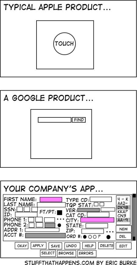
One of the best examples of this is the Google search page. Behind the scenes, Google has hundreds of servers, that continually scour, catalog, and index the Internet, so that when you type in a question, they can provide links to possible answers. Yet the page itself is very simple. A few unobtrusive links, one occasionally entertaining and informative logo, and one search box. That’s it. Nothing is there to distract you from doing what your need to do: run a search. All of the complexity is hidden away from the us, the user. We don’t need to know about the petabytes of data, and the thousands of hours that went into the complex algorithms that are used to give us any search result, let alone the one we are after. We don’t care about those things. We just want the results.
So why do we make things so complicated? It just seems to be a part of human nature. Maybe we are afraid that if things are too simple, they’re not important. Or maybe it comes down to communication. We make things seem complex, because we are trying to communicate our ideas as completely as we can, and words are all too often not enough. There is a world of truth in the old saying that a picture is worth a thousand words.
The web is such a wonderful and dynamic method of communication. It combines the written word, along with pictures, videos, audio recordings, and ever-evolving interactions in a way that our options to communicate clearly seem almost limitless. But along the way, we need to remind ourselves of the message we trying to convey, or the information we are trying to capture, and really ask ourselves if all the fluff is really needed. If the answer is no, then that’s a great place to start with making something complex more simple.
 When Episerver and Ektron merged early last year, I knew that my world was going to change. When I finally go the chance to work on an Episerver project, I felt just like Dorothy in the Wizard of Oz, more than a little lost in this unfamiliar world, and on the lookout for dangerous animals in the dark forest. But where Dorothy was afraid of the lions, and tigers, and bears, I’m faced with models, and views, and blocks, and don’t even get me started on controllers. This is nothing like the smart forms, XSD files, and super templates that I am much more familiar with from the Ektron world.
 While I haven’t yet reached the Emerald City by becoming a certified Episerver developer, I am on the path. The forest doesn’t seem so dark now, and I’m excited about all of the Episerver projects that are coming. I love the power that I have while coding the models, the flexibility that the blocks give me, and the structure that is inherent in every page. This is a great platform that I am excited to work on for many years to come.