The Complexity of Simple

Bunny Ears?We make things complex. It doesn’t matter what it is, we can make it seem more complex than it is. Don’t believe me? Let’s take a look at something simple: tying your shoes. This is something that you probably do every day, and something that we teach our children how to do. How complicated is that? I mean, young kids learn how to do it all the time! I remember being taught by looping my shoelaces into two loops (called bunny ears), then wrapping them around each other and pulling tight.

But try and break it down to the basic steps, and you will see how quickly something so simple becomes so horribly complex.

Here is a website that teaches you three different ways to tie your shoes
How To Tie Your Shoes. The shortest method shown has seven steps, but they still need to use videos to demonstrate the techniques. Think about how complicated it would be without those videos. On top of all of that, apparently we have been tying our shoes wrong all this time. Terry Moore: How to tie your shoes via TED Talks

But enough of tying shoes and bunnies, let’s get back to the web and cut to the chase. The web is complicated already. You have web pages, and apps, and content strategy, and oh, yeah — social media, AND inbound marketing, AND stakeholders, AND messaging, AND e-commerce, and — AHHHHH! The list goes on and on. It’s complicated, it’s convoluted, and it’s complex.

Make the Complex Simple

While one of the easiest things to do in design and development, is to make something simple seem complicated; possibly the single hardest things to do is to make the complicated seem easy. Making the complex seem simple is difficult and exasperating, and yet some companies are getting it right.
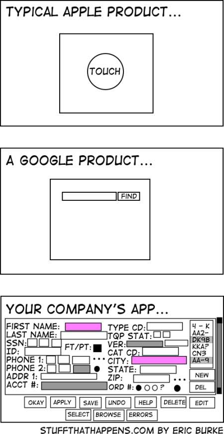
Simplicity

One of the best examples of this is the Google search page. Behind the scenes, Google has hundreds of servers, that continually scour, catalog, and index the Internet, so that when you type in a question, they can provide links to possible answers. Yet the page itself is very simple. A few unobtrusive links, one occasionally entertaining and informative logo, and one search box. That’s it. Nothing is there to distract you from doing what your need to do: run a search. All of the complexity is hidden away from the us, the user. We don’t need to know about the petabytes of data, and the thousands of hours that went into the complex algorithms that are used to give us any search result, let alone the one we are after. We don’t care about those things. We just want the results.

So why do we make things so complicated? It just seems to be a part of human nature. Maybe we are afraid that if things are too simple, they’re not important. Or maybe it comes down to communication. We make things seem complex, because we are trying to communicate our ideas as completely as we can, and words are all too often not enough. There is a world of truth in the old saying that a picture is worth a thousand words.

The web is such a wonderful and dynamic method of communication. It combines the written word, along with pictures, videos, audio recordings, and ever-evolving interactions in a way that our options to communicate clearly seem almost limitless. But along the way, we need to remind ourselves of the message we trying to convey, or the information we are trying to capture, and really ask ourselves if all the fluff is really needed. If the answer is no, then that’s a great place to start with making something complex more simple.


Set Your Phasers to Stunning

Raise your hand if you are a Trekkie. ( If you’re still in the closet about it, just kind of wave your hand under the desk—no judgment).

No matter whether you loved Star Trek, hated it, or fell somewhere in between, there is no doubt that it had a huge impact on modern culture, society, and technology. In fact, when we look back on the multiple Star Trek television series, we can see that in many ways, they represented the zeitgeist of their eras, especially in the color choices and design aesthetics that were used in the sets and wardrobe.

From the primary colors of TOS (The Original Series), to the warm earth tones of TNG (The Next Generation), to the more minimalistic presentations of Voyager and Enterprise where everything was more functional and somewhat industrial, these shows truly represented the styles of the time.

Designing for the Future

One of the biggest challenges that the people working on Star Trek faced was how to know what the future was going to look like, and how it was going to work. But for all of their wild and crazy ideas, they still had to keep things rooted in the present. They had to pay close attention to their target audiences in order to bring the people in and get them to engage in this fantastic world.

Those challenges are very similar to what we face when building modern web sites. We all want to build a vision of the future, but trying to look forward 5, 10, or 15 years is a guessing game at best, especially where the web is involved. The best practices of today might be obsolete next year.

Star Trek did this by imagining a world where the impossible was an everyday occurrence, but here in the real world, we need to focus on understanding who the primary audiences are and craft an experience that will draw them in and engage them today and tomorrow. As designers and developers, we need to build sites that are easy to maintain and update as the technologies and audience needs evolve.

They Always had the Coolest Toys

Star Trek was not just about the colors and designs. They came up with so many great ideas for technology that have become reality today. From the cell phones and flip phones inspired by the Star Trek communicators, to the modern smart phones and tablets that take the PADD (Personal Access Display Device) idea to whole new frontiers, Star Trek changed the concept of what interface design could be. They introduced the idea that software and graphical interfaces could take the place of physical knobs and switches. Data could be accessed wherever and whenever it was needed, regardless of the delivery method.

Real world devices like wireless connected tablets and smart phones have made it possible to have access to almost any data from almost any location. From Responsive Web Design that handles multiple screen sizes elegantly, allowing you to have one site on many devices; to JavaScript libraries that work asynchronously to manipulate data presentation; to more advanced back-end programming and data access techniques that allow us to process more data faster and more accurately; to emerging technologies like the internet of things, we have a huge opportunity to take that data even further.

It Looks Great! But Does it Work?

Star Trek had some amazing sets, and through the magic of television, the crew could make us believe that pressing a button on an empty box opened a communications channel with the neighboring ship or the planet below. It didn’t really work, but that didn’t matter.

But in the real world, we don’t have TV magic. No matter how great and visually stunning a design might be in prototype form, when it comes time to create the actual product, we have to build underneath the pretty façade in order to make it work. Clicking a button has to do something, it needs to do the right thing, and it needs to do it quickly and efficiently. If it doesn’t, then it’s a failure.

Take a look at your own website. How well does the design handle different size screens? Are the buttons easy to use? Are you sending too much data back and forth between the device and the servers each time a new page is loaded? A poor implementation can be detrimental to a web site’s success, and slow performing, non-optimized code can make even the best design a frustrating experience.

The good news is that there are now so many great tools and techniques available for modern web sites, that we can build some of the most functional, easy to use, and visually appealing sites out there. And what you will be able to do in the not-so-distant-future will make what we can do today pale in comparision.

So set your phasers on stunning, ahead warp factor 8, and Engage!

An Ektron Developer in an Episerver World

Models, and Views, and Controllers—Oh My!

We're not in Kansas anymore!When Episerver and Ektron merged early last year, I knew that my world was going to change. When I finally go the chance to work on an Episerver project, I felt just like Dorothy in the Wizard of Oz, more than a little lost in this unfamiliar world, and on the lookout for dangerous animals in the dark forest. But where Dorothy was afraid of the lions, and tigers, and bears, I’m faced with models, and views, and blocks, and don’t even get me started on controllers. This is nothing like the smart forms, XSD files, and super templates that I am much more familiar with from the Ektron world.

But for all of the differences between the two platforms, after a little bit of experience and exploration, I have found, not a scary forest, but a place where things may not be familiar, but aren’t nearly as scary as I first thought.

My Kingdom for Some Structure

While I have been working with the Ektron CMS for almost ten years now, one of the things that took me the most time to figure out was the benefit of using structured content. Now, I think it’s one of the product’s most important features, I just wish that they had taken it a bit further, and made it the default content mode.

Luckily, Episerver provides that structure. I love how we can define the content structure with code, or the Epi interface. This gives us many options to:
– Define the page and block types in code
– Inherit properties from another model
– Define an interface or an abstract model

If I want a similar structure of fields in different content types, I don’t have to recreate them, I can inherit them, opening up a whole world of re-usability that Ektron’s smart forms just didn’t have. This is game changing!

The Building Blocks of a Great Page

I remember thinking that when Ektron first introduced the concept of Page Builder and widgets, that it was pretty cool stuff. Then when I started working for WSOL, and was able to work with their super template, I thought that this was how to do page builder right. But as good as the super template is, Epi does it better.

Never mind the man behind the curtain, the block and content areas in Episerver are the true magic of the page. This is what the Ektron widgets could have been, but never quite achieved. Add a small or large snippet of content onto the page using a defined content structure. Add more than one, and re-order them on the fly. Your content editors don’t have to worry about how it’ll be displayed, they can just worry about getting the right content on the right page. And the icing on the cake—those blocks can be re-used, if needed, or be unique to the current page.

Following the Yellow Brick Road

Follow the Yellow Brick RoadWhile I haven’t yet reached the Emerald City by becoming a certified Episerver developer, I am on the path. The forest doesn’t seem so dark now, and I’m excited about all of the Episerver projects that are coming. I love the power that I have while coding the models, the flexibility that the blocks give me, and the structure that is inherent in every page. This is a great platform that I am excited to work on for many years to come.

How a Rubber Duck Taught Me to Be a Better Programmer

Originally Posted on WSOL.com

It sounds silly, doesn’t it? A rubber duck? It’s a bath toy that your kids play with in the tub. It has no hands, and is made of rubber (actually plastic now-a-days, but that’s just a technicality. It has always been, and always shall be a rubber duck, no matter what it’s made of!). What’s a rubber duck got to do with programming? And how can it teach me anything?

Programming is hard. Don’t let anyone tell you differently. When you write a program, there can be anywhere from one to a gazillion lines of code, and you are going to make mistakes. Sometimes they’re big, sometimes they’re small, but no matter the size, they all take time to find and troubleshoot. Sometimes, you need help. Sometimes, you need…a rubber duck.

Enter the Duck

I first learned about the concept of Rubber Duck Debugging from Deane Barker (@gadgetopia). He mentioned it in his excellent blog post “How to Give a Good Conference Talk”, where he described practicing a presentation out loud, in order to make it better.

The idea of using something, be it a rubber duck, your pet hamster, or the stuffed pink panda bear you won at the county fair, as a sounding board for working through a problem is not new. Almost every business community learns about it eventually. It’s surprisingly simple, but verbally explaining the issue you need to solve or the problem you are trying to overcome can often give you exactly the inspiration you need to figure it out.

But Don’t We Already Do This?

Sure, you can get help from another developer, and I often do (extra bonus points if you can get said developer to dress up like a rubber duck while you are explaining your problem. Keep asking. It’ll happen…), but that takes up their valuable time. If I had a penny for every time I have fought, yelled, and cursed at my program because it didn’t work, only to have someone else take a look at it and say something like “you missed a <comma, semi-colon, variable, reference, etc>,” in under a minute, I would have at least $28.37. Then I feel like an idiot, because I couldn’t see that one little thing.

The great thing about using a rubber duck is that it doesn’t take up someone else’s time. The rubber duck doesn’t judge you, and it is very patient as you work through the issues.

There Is Actual Science at Work Here

There is something magical about explaining your problems out loud, even to something as inanimate as a rubber duck, that can help you see the solution to your issues. Magic aside, there is even some science there as well. (See The Psychology Underlying the Power of Rubber Duck Debugging for a more in-depth explanation.) The act of speaking out loud forces you to slow down and be more precise and thoughtful in your explanations. After all, the rubber duck doesn’t know what you know.

When you go through code line by line, explaining each part to the rubber duck, you pay closer attention to the small details. You don’t gloss over things that you “just know” are there, and instead you pay attention to what is really there. Often times during this process, you see a problem that you missed before. It’s very similar to the idea that you only really start to understand a topic when you try to teach it to someone else.

What My Rubber Duck Has Taught Me

My rubber duck, the “Green Ninja” (Image credit: Tara Mayberry Teaberry Creative)

Here are some of the important lessons I have learned from using Rubber Duck Debugging:

  • I have learned to be more clear and concise when I am describing a problem.
  • I have learned to be more careful while writing code, so that I don’t have to bore him with a lot of extra troubleshooting sessions.
  • I have learned to make a better effort to troubleshoot the issues before bothering my co-workers.
  • And finally, I have learned to be more patient when someone uses me as a sounding board to work through their problems (but I won’t dress up like a rubber duck).

So go out and find your own rubber duck, be it the classic yellow bath toy, or one dressed up like a pirate — pick one that you’re comfortable with and fits your personality. My Green Ninja rubber duck sits in a place of honor, where I can see him at all times. I talk to him, ask questions, explain my problems out loud, and I don’t bother my co-workers as often as I once did. He helps me realize that I know more than I think I do, that I am better than I think I am, and not nearly as clever as I want to be. He just sits there smiling his enigmatic smile, waiting for me to come up with an answer. He is my constant companion when I am writing code, and we work together to make better websites for our clients.

Top Image Credit: Deposit Photos

Confessions of a Non-Super Rockstar Ninja

Does it seem like all of the developer job openings are looking for a superstar in javascript, a back-end code ninja, or a front-end rockstar? Do you read the skill descriptions with more and more dread since while you know some, or even all of, those technologies, you consider yourself to be an expert in all of them. It’s easy to feel discouraged and frustrated.

Hi, My name is Joe and I am NOT a Super Rockstar Ninja

It may seem like a difficult thing to admit, but I rarely fall into the superstar/rockstar/ninja categories. In fact, if this were a Harry Potter book, the Sorting Hat would probably have put me in Hufflepuff, and that’s okay. Hufflepuffs were known for being trustworthy, loyal and hardworking, but maybe not the most clever. So I am not a super rockstar ninja, and I probably won’t ever be, but that doesn’t mean that I am not good at what I do.

I am a self-taught C# developer, specializing in back-end web development using the Ektron CMS platform. I never really learned JavaScript, my CSS is rusty, and the only bootstraps I am familiar with belong on saddles.

Being self-taught, I don’t have the benefits, or the hang-ups, of receiving a formal education in programming. A “Salt of the Earth Programmer”, to coin a new term, more methodical than intuitive. I don’t grasp new concepts quickly or easily, and it often seems like I have to fight them into submission before I eventually understand them. But what I do know, I know very well. And once in a while I surprise even myself and come up with a clever solution to a problem.

Social Media and Your Self-Image

One of the best things about the modern social world is that you can get access to an astoundingly wide variety of people. By reading blogs, listening to podcasts, and interacting with people on Twitter, you can gain insights from some of the most brilliant and innovative minds in the business. I feel a continual sense of awe at some of the incredible ideas that these people come up with, and I am inspired to do more.

The downside to this easy access to such creative and innovative minds, is that it is easy to judge yourself against the high standards that these experts have set on their chosen topics, and come up short. You start to think that because you don’t have the same answers that they have, that you aren’t worthwhile—that if you can’t solve all of the problems, that you are a failure.

You’re not! That’s just your ego talking. And let me tell you, your ego can be an idiot!

Ego (Everyone’s Got One)

Your ego is the thing telling you that you have to have all the answers. That your solutions are the right ones, and the only ones that need to be considered. It’s okay to know that you are good at something, and have confidence in your abilities, but don’t fool yourself into thinking that if you are good in one area, that you are good in all areas. That way lies arrogance, a sure sign of an out of control ego. It’s so easy to go down that path when you have a few successes behind you.

But then you run into an issue that you can’t solve without help, and your ego takes a huge blow. You start to feel like a hack, like a failure. As high as you felt before, you now feel as low. Your confidence is shaken, and and now you’re fragile. But life is full successes and failures. And something is only truly a failure if you don’t learn from it. Plus, failures keep you humble, and willing to learn.

Be a Student and a Teacher

No one is a expert in everything, but everyone is good at something. Every person you meet is going to be better than you are at something, and every person you meet is an opportunity to learn something, if you are willing to be a student.

As Saron Yitbarek (https://twitter.com/codenewbies) said in her interview on http://www.hanselminutes.com/442/being-a-codenewbie-with-saron-yitbarek we need to be students more. We should always be learning, and never be in a hurry to be the “expert” on anything. I know that most days, I feel like more of a http://www.hanselminutes.com/427/what-it-really-means-to-be-junior-developer-with-jonathan-barronville than I do an expert.

But the inverse is also true. You are going to be better at something than everyone else you meet. It might be something simple, or something complicated. Every time you meet someone you have an opportunity to be a teacher, if they are ready to be a student.

I suspect that there are more developers out there like me, than there are the super rockstar ninjas. I also suspect that if you talk to many of those brilliant, innovative people I mentioned earlier, they would probably argue with you about their brilliance, and point out that they have struggles and failures just like we all do. As a general rule, the things people share online are the best that they have come up with, not the first. We don’t see the hard work that it took to get to the point of posting something online.

I build solid, workable code; wrestle with new concepts and ideas; and try to reign in my ego enough to be humble and willing to learn when the opportunity comes my way. I know that I can be successful using my strengths. I am not a superstar, a rockstar, or a ninja, but most days I am satisfied with being good at what I do, and with who I am.

Your Website Goes Vroom!

Originally Posted on WSOL.com
Fast internet

As anyone who has ever done it will tell you, breathing life into a successful website is a big project. There are thousands of little things to think about, hundreds of big things to keep track of, and umpteen man hours spent actually getting the site ready.

Several teams will have their hands on your website way before anyone ever actually sees it:

  • The Discovery Team — This group helps you define and understand what the purpose of the site will be.
  • The Designers — This team lays out the wireframes and prototypes, adding color and personality to the site. At this point in the project, this is where ideas come and go like the wind.
  • The Developers — During this phase, things can get a bit hairy, as this team tries to figure out how to make everything work the way the designers intended. These people screw in all the nuts and bolts to make sure everything is working correctly.
  • The Users — This is your audience. They click on a link, and the page loads with all kinds of information. It’s like magic, and they are okay with that.

I thought of the following analogy a while ago, and think it’s the best way to put the life of a website into terms that anyone can understand: think of your website like an automobile (stay with me; this will make sense, I promise).

Now, in my simple world, there are four categories of people involved with the creation of an automobile:

  • The Designer – This is the person who decides what the car is going to look like — the shape, the color, how many doors it’ll have.
  • The Engineer — This person decides how it’s going to work and what kind of gas mileage it’s going to get. They know where every nut, bolt, and screw goes, and more importantly, why.
  • The Mechanic – These are the people who keep the cars running. They are the troubleshooters of the automotive world.
  • The Driver – I fall squarely into this category. We put the gas in, turn the key, and the car runs. It’s like magic, and I’m okay with that.

See the similarities? Any large scale project needs people with very specific skill sets. These skills may overlap, or they may not, but they always complement each other in a way that breathes life into the project. Both the Designer and Developer (or Engineer and the Mechanic, in the case of the car) need to have a very in-depth understanding of how the project works, but they have a different focus, and the skills sets needed for both jobs are complementary.

But if you are having a problem, who do you want to take your car to? The Engineer can probably figure out the problem, but it might take them a while. They may need to dig into the car, and tear it apart to find the problem. The Mechanic, who is used to looking for problems, might immediately know what the issue is and how to fix it. The difference between an Engineer and a Mechanic is that the Engineer knows where to put the screw, but the Mechanic knows when to tighten it.

Websites are very similar. When there is a problem, you can go back to the team that originally designed and built the site, but a better solution might be to go to a group that specializes in troubleshooting websites.

Maintaining a Healthy Website

The same can be said for the general well-being of your website. Once your website is live, the work doesn’t end there. Like your car, you need occasional check-ups, oil changes, tune-ups, etc.

A strong Content Strategy is one of the keys to a healthy site. You need to keep the content up-to-date, relevant, and appropriate for your audience. If you don’t have anything new, the reasons for people to visit your site will drop dramatically. Fewer visits mean fewer customers, which ultimately results in fewer sales, and no one wants that.

New content can come in many shapes and sizes, from a company blog, to curated articles, to information about new products and services that your company provides. The important part is having a strategy, and following it.

And occasionally, there will be problems. Things happen even on the best websites, and you need to address them, to provide the best experience for your users.

One Stop Shop

WSOL stands out from the crowd, because we offer many of these services. We have a team of dedicated designers and developers who build efficient, workable websites, and we a have a group of experienced support troubleshooters that can fix your site’s problems quickly.

And the best part is that those two teams work together closely and learn from each other. The developers learn what problems the support folks are dealing with and figure out how they can correct those problems during development, while the support team gains a better understanding of why something was done the way it was and how to better work with it.

Building a website is an exciting, frustrating, exhilarating, boring, and necessary part of business today. A huge amount of work will go into the Design, Development, and Testing of a site before it is ready for deployment. But the work doesn’t stop there. The web has a voracious appetite for new and updated content, and your site needs to help feed it. Plus, you need to keep your site tuned up, and address problems as they occur. Having a strategy, and a partner to help, can make all of the difference in the world.

Image credit: Deposit Photos

Can a Silver Bullet Save a Unicorn?

Originally Posted on WSOL.com

Have you ever gone looking for a unicorn? They’re really hard to find now-a-days. Very reclusive. They don’t give interviews, and they never publish their addresses online. In fact, finding a unicorn is the closest thing to an impossible goal that there is.

For those of us in the web industry, a “unicorn” is that perfect website. You know the one I’m talking about—the one with the stunning design that makes everyone who sees it stop and marvel at the sheer brilliance of the mind that created such a wonderful thing. And the content! Words fail to describe the pure literary perfection. The message speaks to everyone in a way that is both deeply moving and compelling.

Yeah, I haven’t found that website either. But I keep looking. The problem is that everybody has different needs, interests, and goals. So while your website might be that perfect unicorn for one person, for someone else it might just be a donkey with a plunger stuck to its head.

Here I Come To Save The Day

Silver Bullet Just Ahead Green Road Sign and CloudsIt seems like everyone is looking for that magic silver bullet that will change the donkey into a beautiful unicorn. They are searching for the latest and greatest thing that will solve all of their website’s problems, all while helping their hair grow back, shine their shoes, and do the dishes. (Okay, maybe not that last one, but that would be so cool, wouldn’t it?)

The truth is that a silver bullet, magical or otherwise, is as much an impossible dream as catching that unicorn. Things come along all the time that do something really, really well, and then, for some reason, people try to get it do everything else. They try to make it into the silver bullet, promising wild claims about how great this new thing is, and how it will do anything and everything you could ever need or want. But it can’t.

There is no silver bullet. What you need instead is a whole box full of silver bullets.

Let Things do What They do Best

Over the last few years, several new technologies, like Responsive Web Design, jQuery, CSS, and Inbound Marketing —to name a few—have emerged that have fundamentally changed the web, helping clever designers, developers, and marketers build some truly incredible sites.

How do they do that? They take a little bit of time to understand the strengths and weaknesses of each technology and use it to its fullest. Then they stop there. Could they make it do more? Sure. Would that be a good idea? Probably not. The cool thing is that so many of the things we use on the web play very well together. So don’t pick just one, thinking it will do everything. You have a box full of these options, allowing you to choose the ones you need, and use them well. Responsive web design is wonderful, but it won’t do a thing if you don’t have a good content strategy in place.Donkey-Plunger

But will it Save the Unicorn?

Now that you have done all of that work, found your box of silver bullets, and gotten them all loaded up, will that plunger-encrusted donkey become a unicorn? I’m sorry to say, probably not. Having the perfect website for everyone is —and always will be— unattainable. So stop trying to achieve that unreachable goal of perfection, and focus on building a great website for the people you are trying to reach: your target audience. It might not be a unicorn, but it won’t be a donkey either.

Structured Content in a Free-Form World

Originally posted on WSOL.com

Free-form content is so…free

It allows for the easy flow of ideas, and communication flies freely on the wings of the perfect word.

When I started working on the web, oh so many years ago, the idea of structured content didn’t exist. We all just wrote HTML. Everything went into a p tag, or—and I can’t belive we did this—a table (we were so young and naive back then).

Then I started working with a CMS. I would like to say that velvet ropes began to part and champagne fell from the sky, but the truth is, that free-form philosophy was still deeply ingrained. All the CMS did was give me a decent web interface in which to enter my HTML. And everything was fine, as long as I was the one in charge of entering and maintaining all of that content. Unfortunately, things went downhill quickly when other people started to get involved. We had headlines in pink, images with rainbow-colored callouts, pages with everything they could think of on them, and others with nothing—it was chaos.

That’s when I realized free-form content isn’t free. It has a cost.

It costs you control—unless you are the one doing everything, and who has time for that?

It costs you consistency—unless everyone is diligent, concientious, and actually pays attention to the style guides, and who is excited to do that?

It costs you time—and there’s never enough of that.

Structured content is so…restricted

It forces all of your nifty ideas into little boxes and fields, putting your perfect words behind bars.

Once I realized that free-form content wasn’t so great, I started taking a look at structured content. For Ektron, that meant smart forms. I may have gone a little bit overboard for a while. I put everthing into smart forms. A list of items? No problem, here is a smart form with a repeatable group box to build that for you. You want a hyperlink? We can do that. Here’s a form with three fields for you to fill out in order to get that link on the page.

It worked, kind of. The pink headlines went away, and the only rainbows on the site were in pictures of the sky after a rainstorm. But there was still no champagne falling from the sky, and not one velvet rope parted for me.

I realized that I had gone too far toward the other extreme, and it had a cost.

It cost us the freedom to be creative—and everyone wants that.

It cost us the ability to be flexible—and everyone needs that.

It cost a lot of trust—because each project is unique, and I couldn’t deliver.

Back away from the extremes and proceed smoothly down the middle

When I started working for WSOL, I found that they already had some great solutions for doing exaclty what I now know we should have been doing all along: find a middle ground between free-form and structured content. Smart forms to direct the users down the paths they need to go for consistency on the website, while still allowing for free-form content that plays well within that structure.

Would you like to have a tabbed interface? No problem! We have just the smart form to do that. How about multiple columns, which can include other content blocks? We have that covered too.

The great thing is that these experiences are not a complete failure if you learn something. My journey taught me that going to the extremes is rarely a good thing, and that what we need is a happy median, some middle ground, where we have the structure for consistency, but are still able to be creative.

Do you want to be able to edit your website with the confidence that you can add whatever content you want while still maintaining a stylistic consistency? Contact us to learn more about how we can help you find this happy medium, or feel free to leave a comment below and share any questions or comments you might have about structured vs. free-form content.

THE WEB IS…

Originally posted on WSOL.Com

A while ago, I ran across a video that really changed the way that I think about the web. It was a presentation on Vimeo, of a talk that Ethan Marcotte gave during the 2012 Build Conference in Belfast, Northern Ireland, titled “The Map Is Not The Territory.

Like many things that Ethan has written and presented, this one was very well organized, informative, and thought provoking. He combined history with map making, with evolution, and the web, to make a profound statement that really gave me pause.

At approximately 19 minutes into the video, Ethan puts up a simple statement saying “THE WEB IS”, and then quickly goes through a number of things that complete that sentence.

  • THE WEB IS mobile
  • THE WEB IS http
  • THE WEB IS documents
  • THE WEB IS css
  • THE WEB IS design
  • THE WEB IS content strategy
  • THE WEB IS social
  • THE WEB IS …

Well, you get the idea. This statement was only up on the screen for a couple of minutes during his talk, but it made me ask:

What is the web?

Over the next several days, I kept coming back to this question. Yes, the web is all of the things that Ethan listed, and much, much more. But is that all that it is? The answer is a resounding No. Those are just some of the things that the web is made with and of, they are not the thing itself. As Ethan says in his talk, they are the map, not the territory. (For more information on the Map-Territory relationship, you can read about Korzybski’s Treatise)

What if the web is something different for everyone? That started to make some sense, because everyone has different interests and needs, and they go to the web for different reasons. So then:

What is the web for me?

The web is my life. As a developer, I spend 95% of my working day interacting with some aspect of the web, whether that is writing code, troubleshooting an issue, researching a technique or process, or communicating with others, it is all done with and on the web. It is the doorway into the world through which I go to earn my living.

I then started looking around, and talking to other people. For my wife, the web is a place where she goes for research about the latest graphics project that she’s working on; it is shopping for clothes and making travel arrangements. It is a place to keep in contact with friends and family who are not close by.

I found that for some people, the web is a mystery that they have no interest in. It simply doesn’t fit into their lives.

So what is the web?

As I continued to ask this question, I realized that it’s not just that the web is different for everyone, but that it changes for everyone all the time, depending on their current needs and interests. During the work day, the web might be a research and development tool. At night, it’s entertainment. When I don’t know something, it’s my teacher; and when I need something, it’s my store. It has become such a constant and pervasive part of our lives, that we don’t even think about using it anymore.

So, if the web is so many things, to so many people, how then, can we be successful with it? The key, really, is not to try to be everything for everyone. The web as a whole, is all of the things that have been mentioned, and while the web is certainly greater than the sum of its parts, it is those parts that make it what it is. The web is made up of millions of individual web sites, with billions of web pages, each one catering to a different group of people.

As a developer, I have seen how having an in-depth discovery process, uncovering information about the people who will be using the site, benefits everyone involved. Knowing that information in the beginning of a project enables the designers and developers to focus on what is important, on what is relevant, instead of on what is pretty. As the designers and developers of the web, understanding the fact that the web is many thing to many people helps us to build a better experience. A better web.

THE WEB IS

When people come to your site, they are more than just traffic, more than just numbers, or conversions, or dollars. They are individuals with a unique view of the world. Individuals with their own needs, their own priorities, their own desires, and they came to your site in search for something. In some cases what your site provides might be the map. For others, it is the territory.

But if your piece of the web can provide them with what they need, when they are ready for it, then you are on the road to success. You are contributing to the greater whole.

The Value of Re-Typing Code

Originally posted on WSOL.Com

Our civilization is built upon the foundations that were laid down long ago. Once we find something that works, we tend to emulate it in order to move forward. The world of web development is no different. In fact, it is probably worse. We steal borrow code all of the time. If we run into a problem, there is a good chance that someone has posted a solution somewhere on the internet, and our google-fu is strong.

Better understanding of what is going on

By re-typing the code, you start to get into the mind set of the person who solved the problem. And after all, isn’t that why you are there in the first place? To learn and understand? You start to see the patterns of good code, and recognizing bad code. And with better understanding, comes more intelligent observations, questions, and your own ideas on how to take it another step forward. I can’t tell you how many times something has “clicked”, and I understand something that had been eluding me to that point.

Muscle Memory

Don’t laugh at this one, it’s important. Raise your hand if you took typing in school. (Ok, guess I am showing my age. How about keyboarding, they still teach that, right?) What was the main thing you did during those classes? That’s right, copy text. That’s how you learned to type. How your fingers figured out where the keys were to make coherent words, without you having to go through the ‘hunt and peck’ torture routine.

Re-typing code is the same thing. Your fingers will get used to the routine of typing. Certain key combinations will become much easier, almost second nature.That, along with a better understanding of what the code is doing will help your coding speed improve dramatically. I promise.

Better Troubleshooting Through Typos

Don’t you just hate typos? There is nothing worse than spending half an hour to find that one command that had an “e” instead of an “i”, or that missing semi-colon. (Ok, there are a lot of things that are worse than that, but very few more frustrating. [Ok, there are many things more frustrating, but I think you get my point]) It’s funny, but finding those typos really does make you a better troubleshooter. It helps you recognize broken patterns in the code, which helps you understand what is going on even more.

Incremental Testing

Building an application, a web page, or anything else really is a pretty cool thing. Watching the pieces come together to make the whole is almost magical at times. When you are re-typing, you can test throughout the process. Find out what that last bit code did, and see it in action. Or watch the whole thing crash, and start the troubleshooting process knowing that it is easier to check ten lines of code than it is one-hundred.

So the next time you find that perfect code solution online, don’t just copy and paste it into your page, take the time to actually type it out. Obviously, project deadlines, client site development, troubleshooting, etc., don’t always allow us the luxury of retyping code, but when possible, the benefits are pretty great. You will find yourself a better programmer for it.